
Track scores over time
One analysis says where a project stands today. A series of them says where it is going. The project page shows that series in two tabs. Stats charts what moved between scans. History lists every completed scan and opens any of them in the dashboard.
Open a project from your organization's project list, or from Project overview in the dashboard sidebar. The page opens on Stats.
A project on a public GitHub repository has a public project page, exactly like its dashboard: anyone with the link can view the history, with no account. A private repository and a CI upload project can be viewed by the organization and by the viewers invited on the project.
Read the trends
The period selector at the top of the Stats tab offers Last 7 days, Last 30 days, Last 3 months, and All time. Every chart on the tab follows the selected period. The History tab ignores the period and always lists every scan.
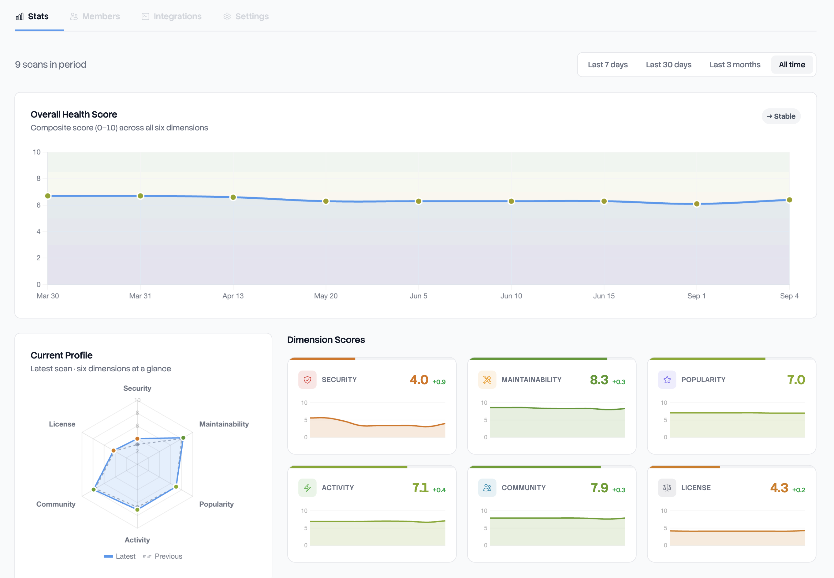
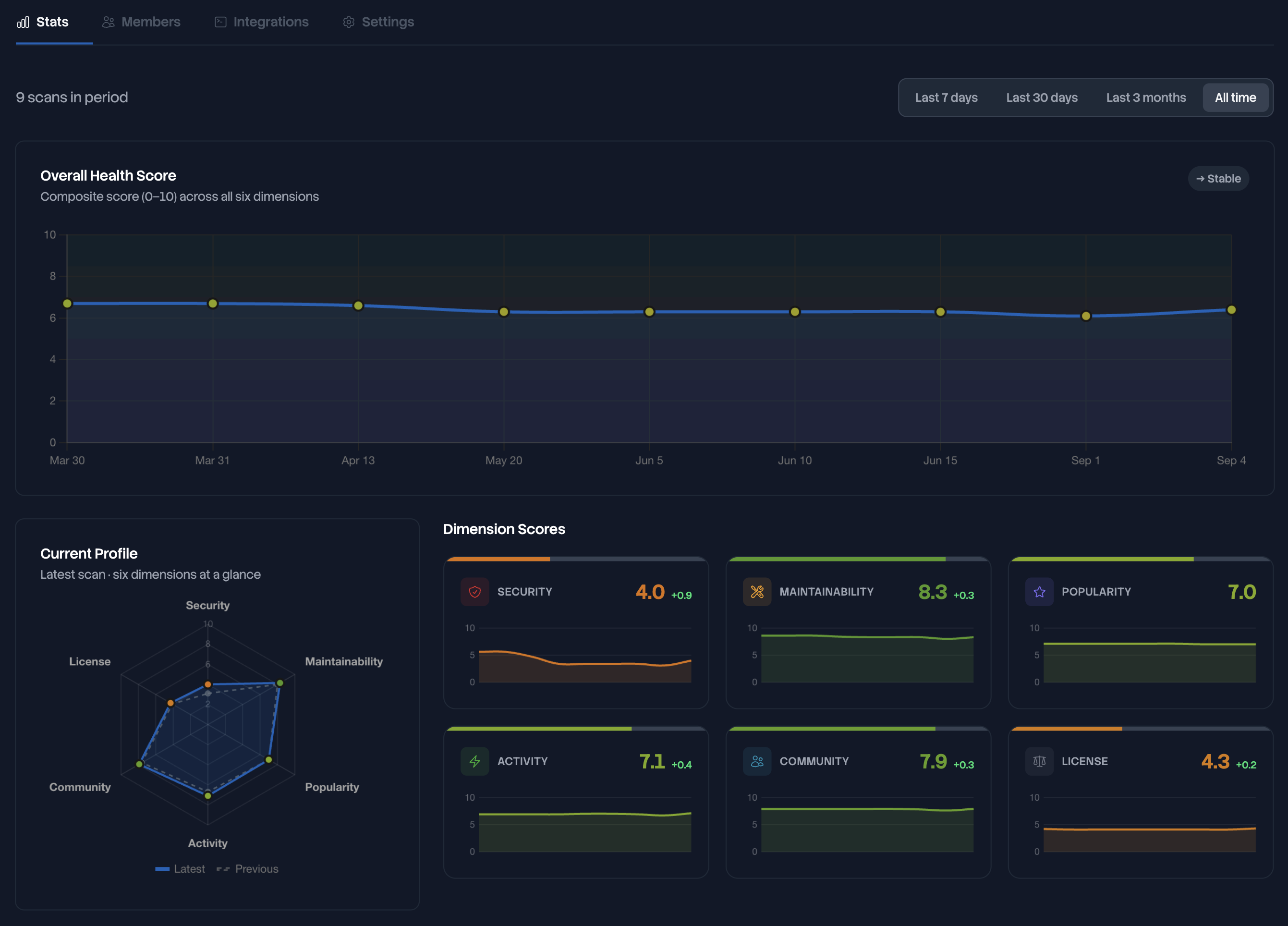
The tab charts your scores at two levels. Overall Health Score plots the project score of every scan in the period. Dimension Scores repeats that for each of the six dimensions, as a sparkline with its current value and its delta. Both use the 0 to 10 scale and the color bands of the health score. In either one the line breaks at a scan that produced no score instead of dropping to zero. Nothing was measurable there, which is not a zero.
A pill in the Overall Health Score header reads Improving, Stable or Declining. It reports the direction of the whole period, not the last movement, and it needs at least three scans with a score before it appears.
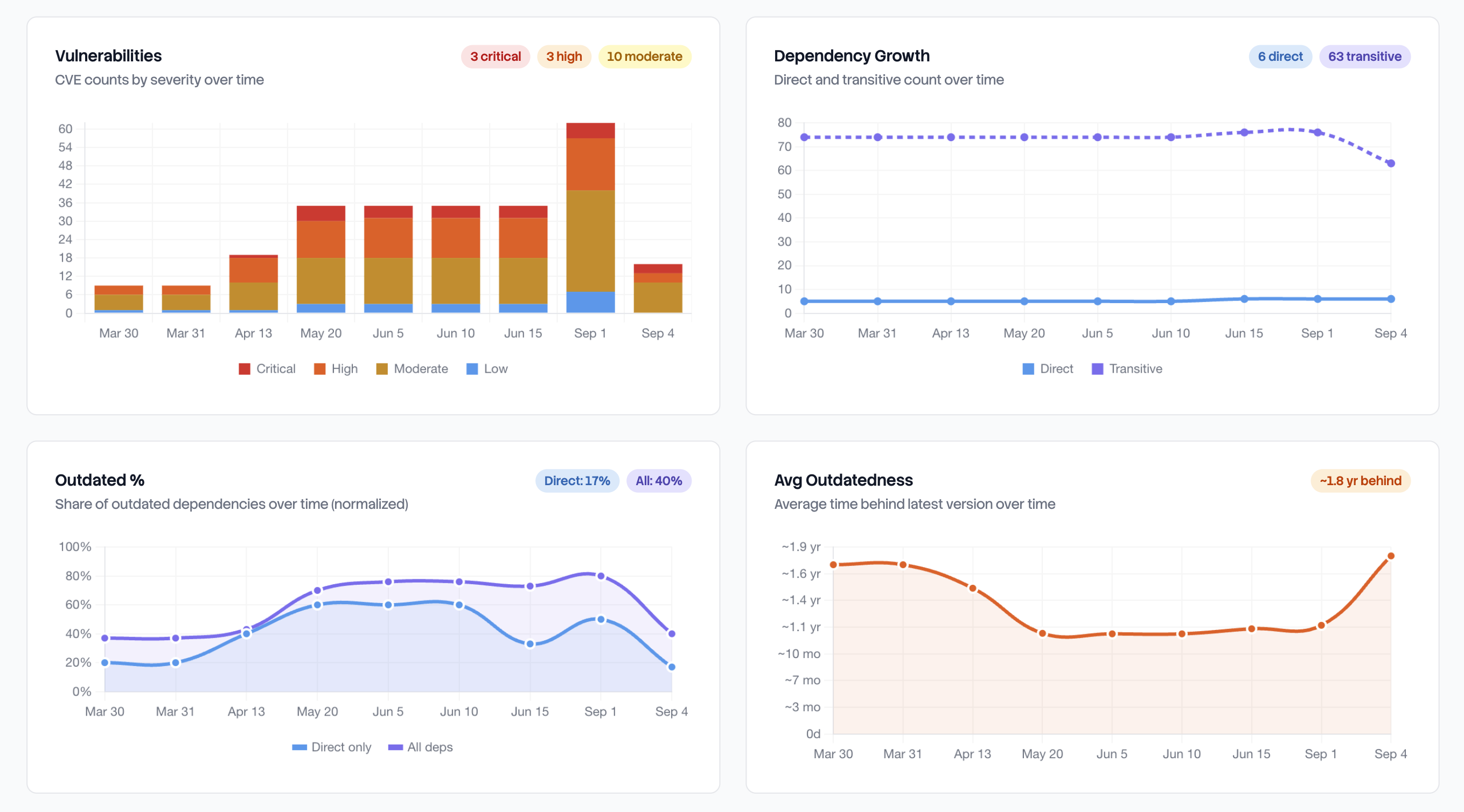
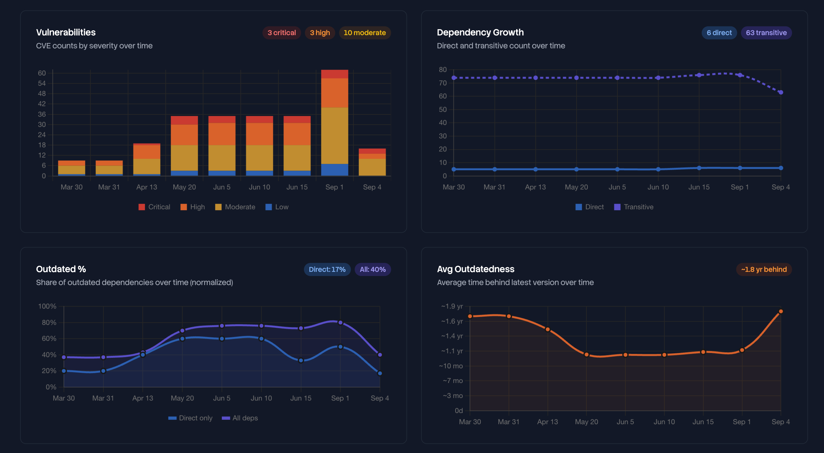
Four more cards chart the rest of the period: Vulnerabilities by severity, Dependency Growth as direct and transitive counts, Outdated % for direct packages and for all of them, and Avg Outdatedness, the average time your packages are behind their latest release.
Vulnerabilities draws one bar per scan, with the four severities stacked inside it. The height of a bar is the total for that scan. To follow one severity, read its segment and not the top of the bar. The pills in the card header count the latest scan alone, not the period, and a scan that found nothing shows a single pill reading All clear.
Read the scan history
The History tab holds the Scan History table. There is one row per completed scan, newest first, with ten rows per page. The period selected on Stats does not apply here, so a scan older than that period is still in the table.
The table shows Date, with the time of the scan under it, Score, Deps, then Critical, High, Moderate and Low for the vulnerability counts, Strong Copyleft, and Outdated, the share of packages behind their latest release with the average delay beside it. The newest row carries a Latest badge, and a scan with nothing measurable shows two dashes where its score would be.
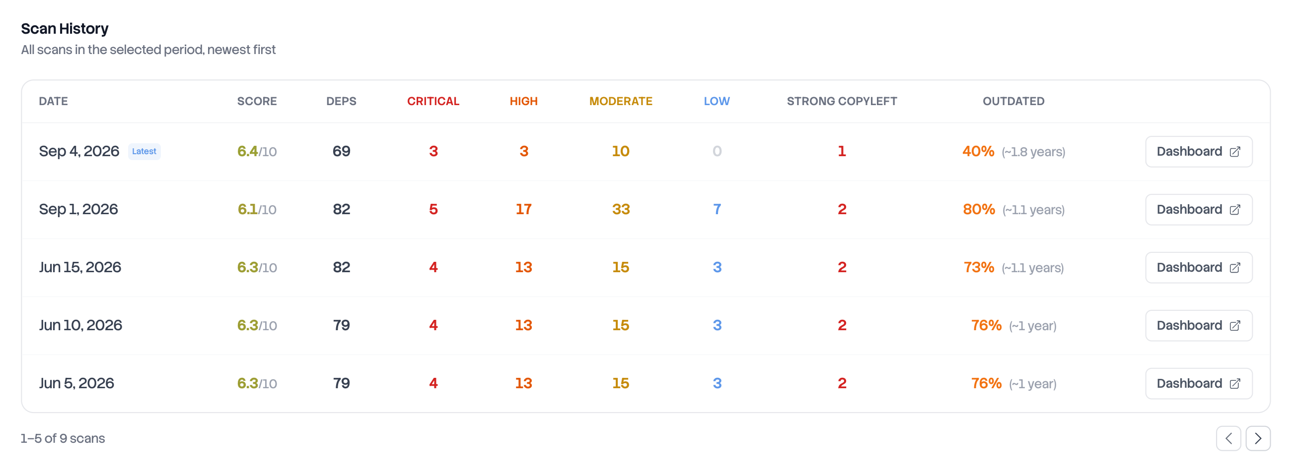
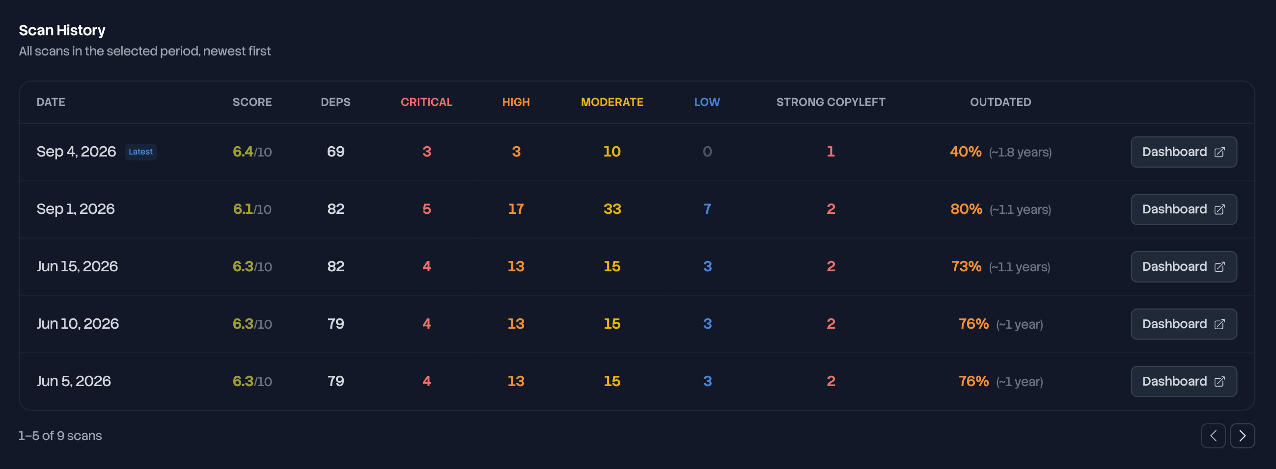
Every completed scan is in that table, whatever started it: Run scan, the API, the GitHub Action, any other pipeline. A scan that fails leaves no row behind.
Deptools keeps every completed scan for the life of the project, so the table goes back to the first one. Deleting the project deletes its analyses with it, and so does leaving the Pro plan for a private project. Organizations and plans covers what a downgrade removes.
Open a past analysis
The Dashboard button at the end of a row opens the dashboard on that analysis. A banner names the date it comes from, and View latest goes back to the most recent one.
The address carries the analysis, so it stays with the analysis when you switch tabs and can be sent to someone else. Whoever can open the project's dashboard can open it.
Three things behave differently in that view:
- The deltas compare that analysis to the one before it, never to the latest. A scan from March reports what changed in March.
- Exports describe the analysis you opened. The CSV, the SBOM and the graph files are all built in your browser from what is on screen. See Export reports and SBOMs.
- The badge does not follow. It always reads the most recent completed analysis. See Add a README badge.
Understand a score change
Every score on the dashboard carries its delta against the previous scan, in points out of 10. The sidebar shows one for the project score and one for each of the six dimensions, and the score card at the top of each analysis tab shows the same number again. The project page also shows a delta under Overall Score, Dependencies, Vulnerabilities and Outdated. Each one uses the unit of the figure above it: points out of 10 for the score, a count for Dependencies and Vulnerabilities, and percentage points for Outdated.
A delta below 0.05 point is not printed, so a score that looks unchanged has often moved a little. And when either of the two scans could not measure a dimension, no delta is shown at all rather than one computed against nothing.
A delta says how much. It never says why, and the cause is frequently not in your code: a vulnerability was published, days passed, ecosystem data was refreshed, or a dependency that could not be resolved last time resolved this time. Why a score changes lists them.
To find what moved, open the two analyses in two browser tabs and compare the same dashboard tab in each. The dimension with the largest delta tells you which tab to open first. For a package by package answer, export both analyses and compare the two files. A CSV is the readable one, as long as you pick the same scope and the same columns on each side. Graph JSON always carries the whole graph, so it is the one to script against. See Export reports and SBOMs.
Next steps
- The health score for what the six dimensions measure and what makes each of them move.
- Scan from GitHub Actions so the history fills on its own, on every push.
- Export reports and SBOMs to turn a scan into a file you can compare or send.
- Organizations and plans for the scan cooldown and for what each plan allows.